My Current Favorite Squarespace Font Pairings
You know I love a good font pairing. Fonts do so much more than make your website look pretty — they set the tone for your entire brand. The right combo creates instant recognition, tells your audience who you are before they even start reading, and builds consistency across every touchpoint. Because when your fonts are working for you, your brand feels cohesive, confident, and unmistakably you.
Squarespace makes it easy to mix and match fonts, but choosing the right pairing? That’s where most people get stuck.

So, I’ve rounded up a few of my current favorite Squarespace font pairings — all pulled straight from the built-in font library — and broken down why they work and what kind of brand personality each fits best.
Let’s get into it.
Unbounded + Space Grotesk
Vibe: Modern, bold, confident.
This combo is bold — with just the right amount of funk. Unbounded brings a ton of personality to headings with its geometric curves and a little bounce in the letterforms, while Space Grotesk keeps your body text clean and legible.
💡 Best for: Modern product or service brands that want to feel approachable but still put-together. Think bold ideas, bright colors, and confident copy.

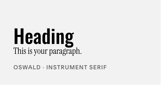
Oswald + Instrument Serif
Vibe: Editorial, stylish, and just a little dramatic.
So I migggghhht be a little biased with this pairing, as it is Ryen Creative’s brand fonts. Oswald is that tall, slightly condensed sans-serif that demands attention, while Instrument Serif brings in that modern editorial charm. Together, they give off “smart magazine” energy — think creative agency, design studio, or high-end blogger.
💡 Best for: Brands that lean into storytelling, strategy, or design. It’s a perfect balance of intellect and edge — professional but not stuffy.
Young Serif + Alegreya Sans

Vibe: Timeless with a twist.
This pairing feels warm, trustworthy, and classic — but still fresh. Young Serif has those elegant little details that nod to tradition without feeling outdated, and Alegreya Sans balances it out with readability and modernity.
💡 Best for: Service-based businesses or lifestyle brands that want to feel authentic, grounded, and human. Think wellness, interior design, coaching, or boutique hospitality.
Boldonse + Georgia
Vibe: Playful luxe meets no-nonsense clarity.
Boldonse + Georgia is a pairing that commands attention without trying too hard. Boldonse is your headline hero: thick, bold, and clean—with just a hint of the unexpected. Its uneven character widths make it playful, yet fully legible. Georgia, on the other hand, brings classic serif elegance to the mix, softening Boldonse’s boldness and grounding the overall look. Together, they strike a perfect balance of confidence and refinement.
💡 Best for: Modern brands with premium offerings—think fashion, beauty, or design businesses—that want to feel elevated and confident, with a dash of the unexpected, without ever looking overdesigned.

How to Choose the Right Font Pairing for Your Brand
When picking fonts, remember: it’s not just about what looks good — it’s about what feels right for your audience and supports your strategy.
Ask yourself:
Does this reflect my brand personality?
Is it readable on desktop and mobile?
Does it pair well with my colors and photography style?
Fonts are part of the brand tone and a voice for your visuals — they can set the mood before anyone even reads a word.
Want Help Picking Yours?
If you’re stuck trying to figure out which font pairing fits your brand personality, I’ve got you. Book a strategy consultation and we’ll audit your current brand visuals, nail down your tone, and make sure your website looks as good as it performs.
Because your fonts shouldn’t just be pretty — they should be strategic.