This Is Not a Template Pack
If you’re just looking for a few pretty templates and a folder link… this isn’t it.
This a real-world look at what I send my clients when they receive the Social Media Launch Pack - not just the deliverables, but the strategy, context, and guidance that comes with them.
Because the value isn’t just in what you get.
It’s in understanding how and why it all works together.
So when a client receives their launch pack, they don’t just get templates. They get a system, explained in plain language, designed to support consistency and confidence from day one.
Keep reading below to see a break down exactly what was included in a recent client delivery - from the reusable Canva templates to the grid guidance, content structure, and brand-specific caption support that accompanied it - along with the reasoning I shared in my emails so they could actually use what they were given.


The Deliverables (Yes, You Get Templates)
Let’s start with the tangible pieces - the assets you’ll use day to day.
The Social Media Launch Pack includes reusable, branded Canva templates designed specifically for your business - your images, your colors, your fonts, your logos, your brand voice. These are built to be revised, repurposed, and reused across posts, reels, and stories, so you’re not constantly designing from zero.
• 5 on-brand 1080 x 1350 static post/carousel sized Canva templates
• 5 on-brand 1080 x 1920 reel/story sized Canva templates
• On-brand story highlight covers
But the templates are only the beginning.
Your Grid, Already Thought Through
Random posting creates random results.
Along with your templates, you’ll receive a suggested grid layout that shows how your content is meant to work together visually. This gives you a clear posting structure - not rigid rules, but a strategic starting point that removes guesswork and creates cohesion over time.
You’re no longer asking, “Does this look right?” … because you already know the answer.
The grid-based approach supports brand recognition, reduces decision fatigue, and helps your audience understand what your brand is about at a glance. When your content follows a visual system, your brand becomes easier to recognize and easier to trust.
The grid isn’t restrictive. It’s freeing.
Here’s the grid that was sent and exactly what I emailed the client:
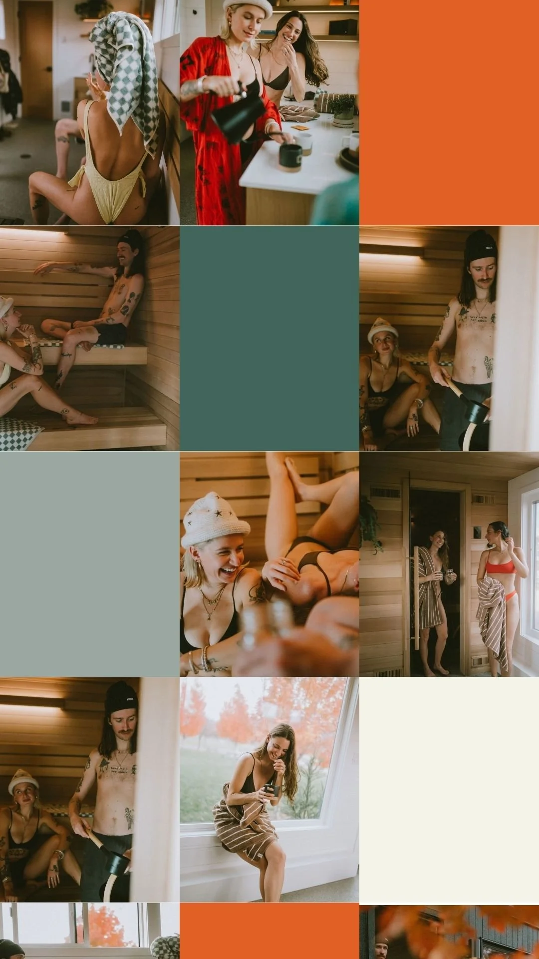
The profile grid layout suggestion: Once people land on a post of yours that piques their interest, they're 90% of the time going to head over to the Nordica Haus from the profile view... and many times based off of that will make a purchasing decision. The grid layout creates a consistent visual rhythm - making the brand feel intentional and elevated. It shows how the brand is modern, social, and design-forward energy and helps people quickly decide if this is their place.
The grid is a balance of people and lived-in moments, and clean pauses (brand color) to keep the feed from feeling cluttered.
Design With a Reason (Not Just a Look)
Nothing in your templates is accidental.
Every design decision, from layout and typography to spacing and color usage, is tied back to your brand -they’re meant to be a representation of your brand across all content types.
When you understand the reasoning, you stop second-guessing your posts - and start creating with confidence.
Keep in mind, good design won’t save unclear content.
You’ll also receive a quick reference guide on your brand’s content buckets and how to rotate through them to maintain balance and consistency. This creates a natural posting cadence that supports your goals without overwhelming your audience… or you.
What I emailed the client:
Template Designs: These templates help protect the brand while making posting faster. All templates use the same brand colors and fonts as the website. This is because consistency builds brand recognition. Visual drift (new colors, random fonts, off-brand graphics) creates friction and breaks down that brand trust... and lower brand trust usually means lower sales conversions.
I tried to be sure to include content examples that fit into each of your content buckets (Brand / Vibe – sets tone and culture, Educational – supports blogs, search, and long-term visibility, and Strong CTAs – clear prompts to book). Rotating these keeps the feed balanced and conversion-focused.
Caption Support That’s Actually Useful
You’ll also receive caption examples to go with the templates designed. These are on-brand in your brand voice to show you how to show up in the captions for both your audience and the Google crawlers.
What I emailed my client:
Remember, Google can now crawl and use your Instagram posts for search listings. So even though people do not want to read a paragraph, the Google crawlers do. Write at least half of your captions for the Google crawlers with keywords included for SEO purposes.
Also, hashtags aren't as important as they once were, so use them if you want (or not), but keep it to like 5 or under per post.
Annnndddd... it's good practice to always have a CTA in your caption. Tell them what action you want them to take next.


Story Highlights: Small Detail, Big Impact
Story highlights are often treated as an afterthought… or worse, ignored completely. But in reality, they’re an easy place to add in some brand recognition which is very important to viewers when deciding whether to trust your brand.
In the Social Media Launch Pack, story highlight covers aren’t added for decoration. They’re designed as part of your overall visual system, giving your profile structure, clarity, and an immediate sense of what your business offers.
Each set of highlight covers is branded to match your templates and grid, so your profile feels intentional from the first glance. More importantly, they’re meant to guide your audience - helping them quickly understand what to explore next without needing to scroll endlessly.
This is also where strategy meets usability. Highlights are designed to support your content pillars, reinforce key offers, and extend the life of your stories beyond 24 hours. When used correctly, they work quietly in the background, turning casual profile visits into informed, confident followers.
They may be small, but they do a lot of heavy lifting.
What I sent my client:


Story Highlight Covers: Story highlights act like a navigation system - quick signals for what matters.Using your brand colors for highlight covers can help reinforce brand recognition in a subtle way, keeps the profile looking clean and modern, and avoids visual clutter at a very small scale. (Because highlight covers are so small, detailed graphics or text tend to look sloppy and inconsistent. Simple color-based covers read faster and age better.)
**If more highlight categories are needed down the road, select images from the brand photoshoot can also work - as long as they stay minimal and cohesive with the rest of the grid.
This Is a System, Not a Shortcut
The Social Media Launch Pack isn’t about quick wins or overnight growth. It’s not your typical template pack either.
It gives your brand a repeatable, strategic foundation, one that supports consistency, clarity, and long-term momentum. When your visuals, messaging, and structure are aligned, social media stops feeling chaotic and starts feeling manageable.
This is not a template pack. It’s the framework your content has been missing.