
Your Brand Is Not More Relevant Because You Used Instagram’s Font
Instagram recently updated its wordmark. And, as a brand designer, I actually think it’s a damn good evolution.
They kept the rounded, handwritten quality that makes the wordmark feel human, conversational, and community-driven, but gave it a sharper, more contemporary digital edge. It feels more current without abandoning what makes Instagram Instagram.
This is not the part I’m mad about.
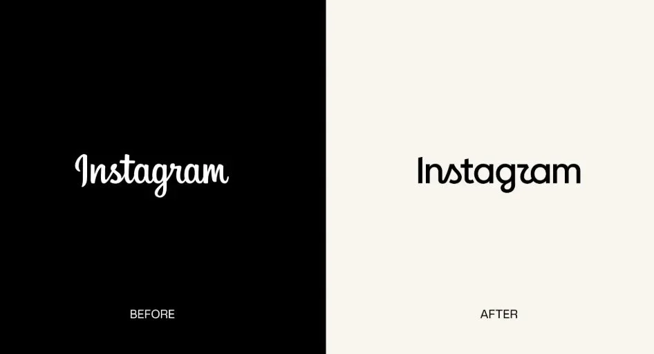
I recently came across a post from a company that said, essentially:
Instagram changed their wordmark, so we thought… why not see what ours would look like in the same font?
And I swear to God, I could feel the fumes coming out of my ears. 🤬
Not because two brands can never use the same typeface. Not because Instagram owns the concept of a modern script. And, not because every single design decision needs to be precious and revolutionary.
I'm mad because this is exactly how branding gets reduced to decoration.
There’s another layer to this particular story that makes it especially painful for me: I used to work for the company that posted this. 🫣 I was their designer. And, creative decisions like this are a pretty damn good example of why I eventually left.
No, I’m Not Naming Them
Before anyone starts trying to play internet detective, I'm not naming the company… Because I have integrity, y'all.
This isn't about publicly dragging a former employer. I'm not interested in sending people to their page, embarrassing anyone, or turning this into some weird professional revenge tour. I'm talking about it because the post perfectly illustrates something I have spent years trying to explain to clients:
Branding is NOT choosing things you like!
And it sure as hell isn't choosing things because another brand is using them successfully. 🙄
“Instagram Did It” Is Not a Creative Strategy
Here's the thing, Instagram didn't choose that typography because it's trendy. They chose it because it makes sense for Instagram.
Think about who Instagram is talking to:
Young-ish demographic.
Digitally native.
Community-oriented.
Creative and fluid.
Human, but living inside a technology product.
A modern, handwritten wordmark can absolutely communicate a lot of those things.
Now imagine a completely different company, who’s target audience is:
Older-ish demographic.
More nostalgic.
More traditionally masculine.
Its product, history, and customer experience have almost nothingggg to do with digital culture.
Now question for you: Should that company use the same visual language simply because Instagram just did?
NO.
I’ll say it louder for those in the back… NOOOOOOOOOOOO!
That's the entire fucking point of brand strategy.
A font doesn't become strategically appropriate for your company because another, more culturally relevant company uses it. If anything, blindly borrowing their visual language can make your own brand less distinct.
On Typeface Usage Within Your Brand
A Typeface Is Supposed to Say Something
Typography isn't just about whether something “looks cool.” Type communicates before someone consciously processes what the words even say. It can feel:
Established or rebellious.
Masculine or feminine.
Editorial or utilitarian.
Nostalgic or futuristic.
Premium or accessible.
Institutional or playful.
Human or technical.
That doesn't mean there is one mathematically perfect font for every audience. Design is more nuanced than that. But it does mean there should be a reason behind the choice.
Who are we talking to?
What do we want them to feel?
What expectations already exist in this category?
Which of those expectations should we reinforce?
Which should we challenge?
What makes this company recognizable when its logo isn't sitting conveniently in the corner?
Those are branding questions. “Instagram used this font and it looks cool” is not.
Your Brand Is More Than Your Fucking Font
And this is where I think businesses get branding spectacularly wrong.
Your brand is not your logo.
It isn't your color palette.
It isn't your font.
It isn't your Instagram grid.
Those are expressions of the brand. The brand itself is the larger system underneath them.
It's your positioning.
Your audience.
Your personality.
Your values.
Your point of view.
Your voice.
Your customer experience.
Your reputation.
The emotional territory you want to own.
The visual identity should come after those decisions because its job is to communicate them.
Relevance Cannot Be Copy + Pasted
And, this is probably the part that bothers me most.
There is this temptation (especially inside established companies that desperately want to feel younger, cooler, or more culturally relevant) to look at brands that already possess those qualities and copy the visible parts.
Use their typography.
Borrow their tone.
Jump on their trends.
Mimic their content.
Suddenly we'll feel relevant too, right? Except relevance doesn't work that way.
You cannot Photoshop cultural relevance onto a brand. You have to understand why your audience should care about you in the first place.
Sometimes the smartest thing a brand can do is look nothing like the brands currently getting attention. Maybe your audience doesn't want “modern digital cool.” Maybe they want
Heritage.
Nostalgia.
Familiarity.
Ruggedness.
Tradition.
Maybe the strategic opportunity isn't to make your 60-year-old customer feel like they're suddenly using Instagram. Maybe it's to make them feel deeply understood by a brand that actually knows who the hell they are.
THAT is relevance.
And Yes, This Is Why I Left
This particular post hit a nerve because I was in the room for these conversations. I was the designer trying to explain why “I like this” is NOT the same thing as “this is right for the brand.”
I tried to advocate for their target audience. For brand consistency. For real strategy. And, for making creative decisions based on what the company is trying to communicate instead of whatever happened to catch the manager’s eye that week.
Eventually, there comes a point where you realize you're not arguing about fonts anymore. You're arguing about whether design is viewed as a strategic business function within the company’s culture, or if the person sitting behind the computer’s job is to just make whatever someone asks for look nice.
Those are two very different jobs. I wanted to do the first one. So, I left.
So What Should You Actually Do Instead?
First of all, stop treating other brands like a fucking mood board. You should absolutely pay attention to trends and study what successful brands are doing. But for the love of God, understand why it works for them before you slap it onto your own brand and call it relevant.
Before you change the font, copy the campaign, jump on the trend, or post the “Instagram did it, so we tried it too!” graphic, ask:
Does this actually make sense for our brand?
Does it speak to our audience?
Does it reinforce what we want to be known for?
Does it make us more recognizable as us?
If the answer is “no" (or even worse, you can’t answer them), don't fucking do it.
Say it again with me: Copying the visible choices of a culturally relevant brand does NOT make your brand culturally relevant. It makes it look like you don't know who the hell you are.
Steal the thinking. Not the font.